
How to find the perfect red nail polish
Ever wonder why some shades of lipstick don’t quite look right on you, but look incredible on someone else? Finding the right colour in anything—from lipstick and clothing to nail polish— all comes down to colour theory and understanding your natural undertone.
It’s not as complicated as it sounds. All you need to do is match the base pigments of the polish (whatever the colour may be: blue, orange, brown, or in this case, red) to the natural undertone of your skin. Once you have this figured out, you’ll be able to easily tell if whether or not a colour will complement your complexion.
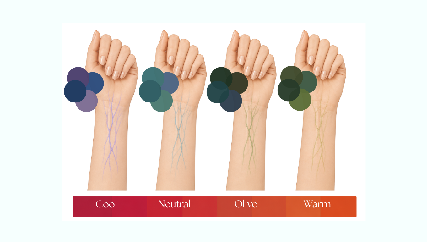
There are four main categories of undertones. Not to be mistaken for skin tones, undertones are beneath the skin and can be easily identified by the veins on your hand, inside your wrist and elbow.
While it's hard to categorize everyone perfectly, this article will hopefully help you find where you fall on the spectrum. From cool and warm at the ends to neutral and olive in between. If you're unsure, simply pick the one that most closely resembles your vein colour.
Let’s break down each undertone, highlight which colours work and which ones to avoid. Take a look at the veins on the inside of your wrist in natural daylight. Indoor and artificial lighting can skew warm or cool.
Cool
Vein colours: Blue, royal blue, deep purple, violet.
Your best red: Look for blue-based reds, deep rubies, crimsons, and berry tones. Example: OPI I'm Not Really a Waitress or Essie Ruby Satins.
Look for: Colours with cool pigments that will flatter the coolness in your skin, making them look bright and clear.
Avoid: Heavy orange-reds, or yellow brick reds, which can make cool skin look overly flushed or sallow.
Neutral
Vein colours: Blue-green, a mix of both distinctly blue and distinctly green veins, or veins that match your skin colour so closely that they are hard to categorise.
Your best red: True primary reds with an equal ratio or cool (blue) and warm (yellow) bases. Example: Essie Really Red and OPI Big Apple Red.
Look for: Neutral undertones can wear almost any shade, but a true ‘Hollywood’ red stands out the most.Avoid: Very few restrictions, but overly muted tones that aren’t balanced to avoid looking washed out.
Olive
Vein colours: Muted dark green/olive, deep teal, or a combination of green and subtle purple/blue.
Your best red: Deep burgundy, dark oxblood, maroon, rust, and earthy brick reds. Example: OPI Malaga Wine, Essie Wicked.
Look for: Deep, muted brown or dark plum/wine bases that harmonize and balance out the green undertones.
Avoid: Neon orange-reds, bright corals, or pastel cool pink-reds, which will bring out grey or shadowy tones and create a sallow or washed-out look.
Warm
Vein colours: Bright green, olive green, or teal-green.
Your best red: Orange-based reds, tomato reds, poppy, coral-red, and warm terracotta. Example: Essie Geranium.
Look for: Anything with warm or bright yellow/orange bases which will harmonize naturally.
Avoid: Deep blue-based plums or icy cool berries, which can clash or wash out warm complexions.